Graphics
The first iteration of the game was very simple in term of illumination:
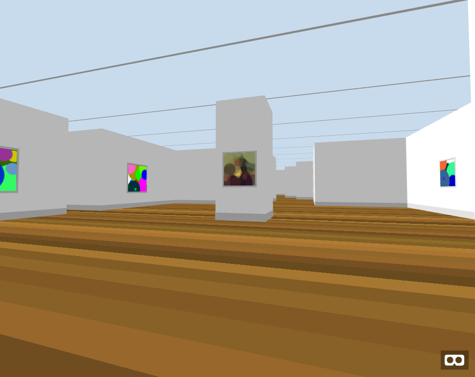
As it is not that bad, it certainly looks ugly compared to the last version.
To achieve this result, I implemented a few tricks.
Art direction
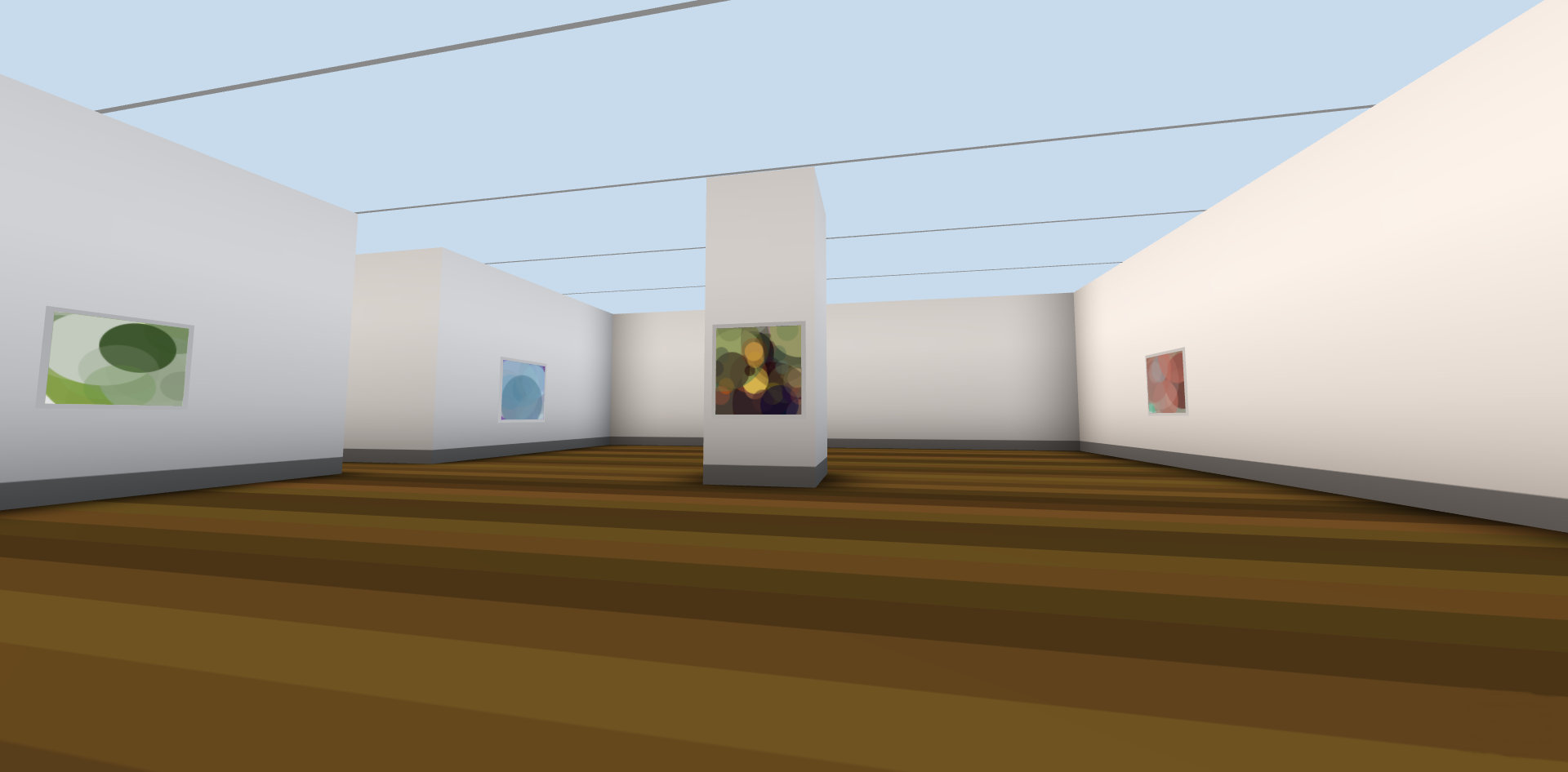
Walls
The walls are derived from the ascii world map. There is no fancy decoration, just plain white walls as in a museum.
Floor
The floor mimics a wooden parquet. I believe that the horizontal lines helps to give position awareness. The player can tell he is facing north / south by looking to the floor. Which can be otherwise hard to determine with all the same looking white walls.
Roof
The glass roof with horizontal frame serve the same orientation purpose. It's positioned higher than the wall to ease the feeling of confinement.
Lights
I used a combination of 3 lights:
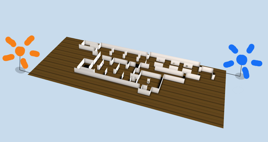
One ambient neutral light.
Two points light, one blue and one orange, at opposite position.
This gives a warm feel to north faced wall, and a cold feel for south faced ones. It helps to make the volume more obvious.
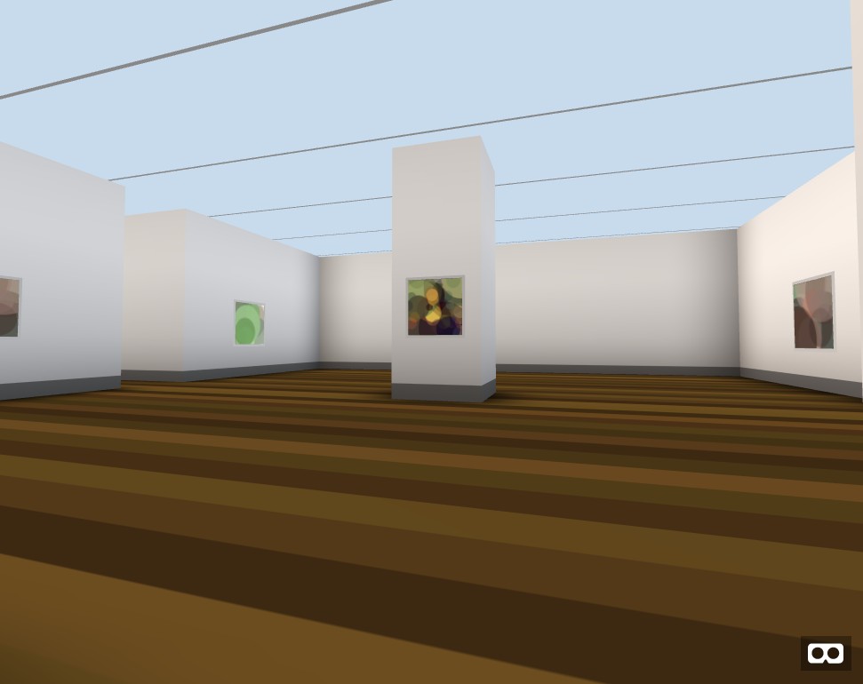
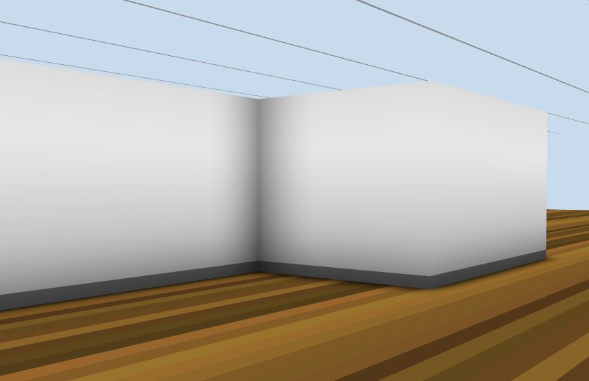
Ambient occlusion - wall
Again, to accentuate the volume I use an ambient occlusion map on the walls.
This technique displays static shadows. This shadows express the fact that ambient light comes from every direction. Therefore in a corner where most direction are obstructed (occluded), the ambient light is less powerful.
Technically speaking, what I did here is:
Generate a shadow map at initialization, for a single corner.
Notice that there is a pronounced shade at the bottom:
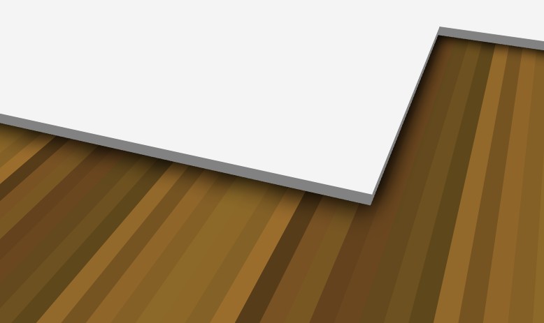
For every corners, determine it is a "inside" or "outside" corner.
   ####
   #  <-  this is an inside corder
   #

   ####  <-  this is an outside corder
      #
      #
Apply the texture accordingly:
If it's a "inside" corner it should display the corner, if not it should at least display the bottom shadow. This is achieve by carefully setting the texture coordinates UV.Ambient occlusion - floor
For the floor, I did another approach. I generate an unique ambient occlusion map for the whole floor.
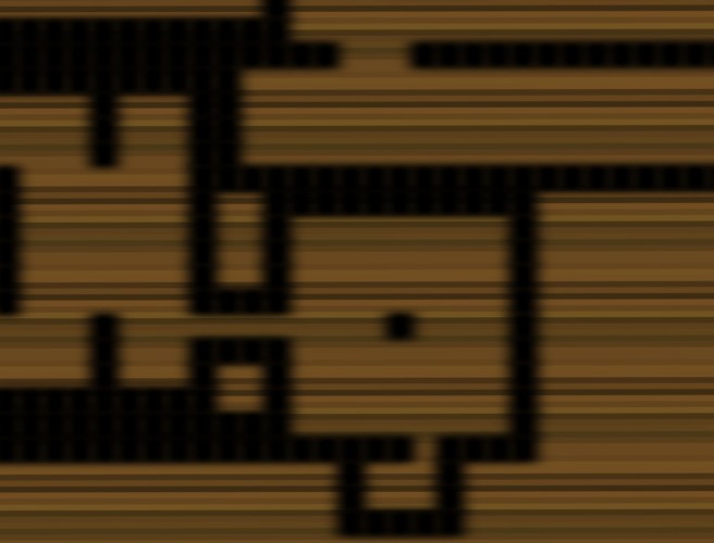
To do so, I simply draw each wall cell on a canvas with a blur filter. If you look closely you can actually see the squares.
Here is the result:
Some says it may be too strong. But hey! since I implemented it, better make it obvious.